Posts Tagged ‘Timothy Noah’
A Poor Man in a Rich Country
In Timothy Noah’s last installment on his series on inequality, he makes the case that rising income inequality is a concern for our society. For the most part, I agree with him. But while addressing some of the common counter-arguments, I have to take issue with this one:
Quality of life is improving. This argument has been made by too many conservatives to count. Yes, it’s true that an unemployed steelworker living in the 21st century is in many important ways better off than the royals and aristocrats of yesteryear. Living conditions improve over time. But people do not experience life as an interesting moment in the evolution of human societies. They experience it in the present and weigh their own experience against that of the living. Brooks cites (even though it contradicts his argument) a famous 1998 study by economists Sara Solnick (then at the University of Miami, now at the University of Vermont) and David Hemenway of the Harvard School of Public Health. Subjects were asked which they’d prefer: to earn $50,000 while knowing everyone else earned $25,000, or to earn $100,000 while knowing everyone else earned $200,000. Objectively speaking, $100,000 is twice as much as $50,000. Even so, 56 percent chose $50,000 if it meant that would put them on top rather than at the bottom. We are social creatures and establish our expectations relative to others.
Ironically, the Woody Allen firm that the last words link to seem to make the counter-argument: that such thinking is wrong-headed and that what matters most is where the train is heading and not which car you’re on. But moving past that…
For one thing, in doing a little searching I found a study that claims to contradict the 1998 study that Noah refers to. I can’t read either of them without paying, so I can’t compare the two, but my point is just that the conclusion of one study doesn’t prove or disprove something. You have to look at how the study reached that conclusion and compare that conclusion with other similar studies. Most of the time, scientific studies make very narrow conclusions that are then generalized too far by the media. I suspect that might be going on here.
But what I really didn’t like about this argument was that Noah, despite I assume being knowledgeable about economics, doesn’t even mention a glaring flaw in the methodology as he describes it: money does not equal wealth. The number 200,000 doesn’t mean anything without knowing how much “wealth” or “quality of life” that buys. If everyone were to double their income tomorrow, but that wasn’t matched by a corresponding increase in productivity, that doubling of income would be meaningless since everything would cost twice as much. By asking the question in terms of dollar amounts, which are meaningless without a reference to the wealth that it represents, the question is clearly flawed. The assumption, it appears, is that people would think that in both scenarios a dollar has the same buying power. I don’t think that’s a valid assumption. Granted, most people don’t consciously make the distinction between money and wealth, but I think subconsciously people have an intuitive sense that your buying power does not depend only on the quantity of money that you have, but on the total quantity of wealth and the share of it that your money represents. If everyone earned two million dollars and you earned one million, do you think you’d be able to buy a mansion? I think it’s obvious to most that you wouldn’t, but in case it isn’t, ask yourself this question: who would build it?
Would you even be able to afford any house at all?
Reagan and the “Stinking Rich”
In my last post I explained that the Bush tax cuts did not disproportionately favor the rich, as it commonly believed. The rich are paying a greater share of the total tax burden than they were before the Bush tax cuts, even when adjusting for the increase in their total share of wealth over the same period of time.
But it’s worth looking further back to see how the tax burden has shifted over time. So, I’ll do the same analysis going back to 1979. I’d go back further, but the numbers from the Congressional Budget Office only go that far. In any case, 1979 was just before the Reagan tax cuts which drastically reformed the tax code and greatly reduced the marginal tax rate on the highest income bracket. Therefore, we would expect for the Reagan tax cuts to have favored the rich by shifting more of the tax burden away from the rich to the middle and lower classes. But, before we investigate whether that’s true, it’s worth noting that there is a difference between the marginal tax rate and the effective tax rate. The effective tax rate is the portion of income that is actually paid in taxes. The amount that someone pays in taxes depends on the tax rate and brackets, but that is only part of the picture. If the tax brackets and rates were all the mattered in the tax code, it wouldn’t be several thousand pages long. I think we can agree that what really matters is what taxes people actually pay, not what taxes they theoretically would pay according to their tax bracket’s marginal rate. So, even though Reagan reduced the marginal tax rate on the rich, that doesn’t necessarily mean that the rich are paying less taxes.
I won’t go through the details of my process like I did last time. Here are some graphs representing how the tax burden and income are distributed, and how that has changed since 1979. Click on the graph to view a larger version.
Not coincidentally, the two graphs look very similar. The interesting thing to note is that the rich are paying a much greater share of the tax burden, but they also are making a greater share of the income. We have to adjust the tax share by the income share to determine if the Reagan tax cuts increased or reduced the tax burden on the rich. Here is the resulting graph:
This is a bit more interesting than the graph when looking at the Bush tax cuts that I discussed in the last post. The tax burden picture actually hasn’t changed very much, but there are some small changes. Firstly, the poor and most of the middle class (up to the 60th percentile) are paying a smaller share of taxes than before Reagan. Secondly, the upper-middle class and most of the rich (up to the 99.5th percentile) are paying a greater share of taxes. Lastly, the super-rich, those in the top half percentile, are paying a smaller share of taxes than before. These are the millionaires, or the “stinking rich” as Timothy Noah refers to them.
So, what can we conclude from this? First, that the Reagan and Bush tax cuts made the tax structure more progressive for the vast majority of the population, contrary to the prevailing wisdom that the opposite is the case. The exception, though, is that the super-rich benefited from Reagan’s cuts. With this in mind, it is interesting to note that Democrats may be backing off of the fight to let the Bush tax cuts expire on those making over $250,000, and are setting their sites on the millionares instead:
Part of the hesitancy with hiking taxes on the rich, I think, stems from the birth of this “lower upper class.” Americans do really want to soak the rich. But a household headed by a well-paid nurse and a police chief might make $250,000 a year, the income point at which President Obama wants to let taxes rise by letting the Bush tax cuts expire. My guess is that most Americans want to raise taxes on these guys, but not on that nurse and police chief, whose wealth seems reasonable and attainable.
Politically speaking, that sounds about right to me. And it also may be the right way to go in terms of “correcting” the trend that Reagan put in motion.
Again, the caveat to all of this is that “correcting” the trend is not the only way to look at the issue. We haven’t made the case, for example, that the trend needs “correcting” in the first place. There are many arguments for and against extending the tax cuts to the rich. I’m only addressing one angle of the argument: the one that argues that we should tax the rich more because they have gotten too good a deal over the past few decades. My conclusion is that this argument is overblown since the share of taxes that most families making over $250,000 has actually gone up, not down. However, the argument does make some sense when applied to the super-rich–those bringing in an income in the seven digits.
(For data tables and calculations used in this post, see here: incomeinequalityFrom1979)
The Bush Tax Cuts for the Middle Class
Since my last post on chart-truth was such a hit, I thought I’d come back for more and do another spin-off of Timothy Noah’s series on income inequality. Again, from the fifth installment, he dismisses the argument that tax policy is a contributing factor in the great divergence:
Reagan lowered top marginal tax rates a lot, but he lowered top effective tax rates much less—and certainly not enough to make income-tax policy a major cause of the Great Divergence….
The larger point is that you can’t really demonstrate that U.S. tax policy had a large impact on the three-decade income inequality trend one way or the other.
With the Bush tax cuts set to expire at the end of the year and politicians scrambling to figure out how to extend some or all of them, tax policy is bound to be a central issue in the coming months. I thought it was time to examine the question a little more.
Republicans want to extend the tax cuts for everyone, while Democrats want to extend them for only households making less than $250,000 and let the rest of the cuts expire as scheduled. Democrats say that the rich don’t need a tax cut; they aren’t paying their fair share. Republicans counter that the rich are already paying more than their fair share. We can’t investigate this question objectively, since the concept of “fair share” is a matter for philosophers, not economists or statisticians.
However, we can investigate the validity of certain specific claims. The one I wish to focus on is the claim that the Bush tax cuts disproportionately favored the rich, and so we should correct this injustice by not extending the tax cuts on the rich. The epitome of this claim is when the tax cuts are referred to as the “Bush tax cuts for the rich”, which implies not only that the cuts favored the rich, but that the rich were the only ones who benefited. Of course, this is a purposeful exaggeration intended to promote the view that the tax cuts disproportionately benefited the rich.
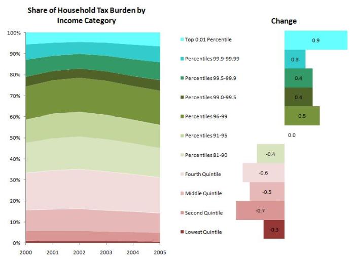
But, hyperbole aside, the question remains: did the Bush tax cuts disproportionately favor the rich? In other words, did the Bush tax cuts make the tax code more or less progressive? (For those who aren’t up with the lingo, a “progressive” tax simply means that the rich pay a greater portion of their income in taxes than others, and a tax is more progressive if the difference between the portion that the rich pay and the portion that everyone else pays is greater.) Republicans think that the tax code has become more progressive and therefore doesn’t need correcting to make it even more progressive. To support their position they point to numbers that show that the rich are paying an increasingly greater share of the total tax burden. This is true, as this graph based on numbers from the Congressional Budget Office shows:
(Here’s a little help on reading this graph and the subsequent graphs in this post: on the left I’ve charted the share of the tax burden for each income category over time. This chart gives a good overview of how the tax-burden pie is cut. But, it can be difficult to see how each individual slice is changing over time. So, I’ve also included the graph on the right which shows exactly how much each income category’s share of the tax burden has increased or decreased over the same period of time.)
On the surface, it seems like a straight-forward rebuttal: since the Bush tax cuts took effect, the rich have been paying an increasingly greater share of the total tax burden. The share of taxes paid by those in the top 5% has increased, while the share of taxes paid by the bottom 90% has decreased. Therefore, Republicans would argue, the Bush tax cuts must not have favored the rich. In fact, it appears they favored the poor and middle class at the expense of the rich. In other words, they made the tax code more progressive, not less progressive as Democrats argue.
But there is a problem with this analysis. Tax policy is not the only thing that can cause one income group to start paying a greater share of taxes. If that income group starts to gather a greater share of income, logically they will pay a greater share of taxes also, even if tax policy stays the same. As we know from reading Noah’s series, the income of the rich is increasing faster than the income of the poor and middle class, so it makes sense that they would also be paying a greater share of the taxes than before. Therefore, we must investigate whether the increase in taxes that the rich are paying is a result of the change in tax policy known as “the Bush tax cuts”, or the change in income distribution.
First, let’s see how the income distribution has changed since 2000:
The graph shows some increase in income inequality over this period, although it’s not as large as it has been in the past. Recessions tend to hit the rich hard in terms of the percentage of income lost, since the rich tend to get more of their income from fluctuating investments. The recession of 2001 was no exception and mostly explains why the rich didn’t get much richer through this period. The average income for the top 0.01% was cut almost in half between 2000 and 2002, but then rebounded by 2005. Still, there is some widening of the gap with the top 20% gaining income and the lower 80% mostly losing income.
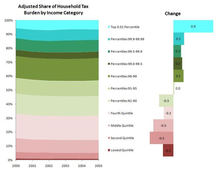
So, we can conclude that this widening of the gap in the income distribution contributed to the widening of the tax burden gap. But we don’t yet know exactly how much. To get a picture of how tax policy affected the distribution of taxes, we have to adjust for the change in the distribution of income. In other words, we want to answer this question: If the income distribution had not changed, would the rich be paying more or less of the total share of taxes as a result of the Bush tax cuts? I won’t get into the details of that calculation (see attached document at the end of this post), but here is the result:
The graph shows that the distribution of taxes, when adjusting for the distribution of income, has changed in the direction of more progressivity, as Republicans argue. The top 5% are paying a slightly greater share of taxes and the bottom 90% are paying a slightly smaller share of taxes, even when adjusting for changes to the income distribution.
So, the Republicans ultimately are right about this, even if their argument is incomplete. The argument that the Bush tax cuts disproportionately favored the rich doesn’t hold up. This will be important to remember as the tax debate rolls on, but remember that this is just one part of the debate. You can still make arguments that rich should be paying more or less, independent of how the Bush tax cuts affected the distribution.
In fact, it may be worth doing this same analysis but going all the way back to 1979, before the Reagan tax cuts, to see how the tax distribution has changed since then. Has the tax code become more or less progressive since the days of Jimmy Carter? I’ll answer that another day, but here’s a hint: it’s a trick question.
(For data tables and calculations used in this post, see here: incomeinequalityFrom2000.pdf)


